You probably know that images can be an extremely important aspect of every kind of website. Not only do pictures get the attention of your website visitors, but they also have tangible search engine optimization (SEO) purposes.
Image size can affect your page speed, so a smaller file means a page will load faster. You certainly want to utilize high-quality images, but you have to make sure they are properly sized for your website to get the best results when it comes not only to creating content that really gets a person’s attention but also loads rather quickly.
Determining the best image size for websites
When it comes to images, you first need to look at what purposes your images will be serving. Here are a few of the possible scenarios.
Regardless of the file format, you are using, be it a JPG, PNG, GIF, or TIF, do not upload any high-resolution images to your website simply for display purposes. Even when a website is displaying images at a smaller size, a URL for an original image can be reverse-engineered from source code and images end up being stolen.
This is not to mention that large images also take more time to upload and can be slower to optimize. Try to use a plugin to handle resizing for you.
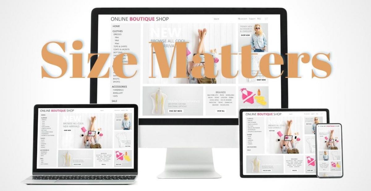
To achieve optimal website performance, your images should only be as large as necessary to fill their containers based on the page layout. Slideshow images will usually be wider, blog images may be medium-sized, and thumbnails are smaller.
When it comes to images for your background, backdrop photos can be designed to fit a wide range of screen sizes, from the average PC monitor to a tablet or a cell phone. The dimension that seems to work best for all screen sizes is 1600 pixels wide by 900 pixels high.
For headers, the best image dimension will be 1024 pixels wide. Many websites have resolutions of 1024px x 768px, meaning a header image of 1024px renders well across the top of a website while not slowing down the webpage speed.
As it relates to background images, the recommended dimension will be 1920 pixels wide x 1080 pixels high. A ratio of 16:9 can fill the surface of a webpage without sacrificing the quality of an image, and an image should retain 72 pixels per inch (PPI).
When it comes to your image file types, JPG file formats are recommended for photos while PNG or SVG files are more common for logos and illustrations. Following these tips can make sure your images load properly and do not slow the page’s load speed.
People who are working with a website on WordPress need to know that WordPress does not support SVG file types. There is a plugin called SVG Support that can help individuals experiencing issues in this realm.
It is important for people to understand the difference between a PNG and JPG because PNG images will be larger than JPGs, making them slower to load. PNGs, however, will support transparency and be of higher quality than JPGs.
Most website images are usually JPGs, but some situations may call for PNGs. It is important to see that you are using the correct PNG file size, possibly with the help of a compression tool that keeps the file size as small as possible.
When you are looking at images for your background, you are going to have a few options:
- Stretch/Cover default — This is typically the default image setting. It stretches the image so it will cover an entire screen in both height and width and is usually the best option because an image acts as a background on any screen size. When there is content on the sides of an image, however, it may not show on mobile phones.
- Contain — Contain can force an entire image to be displayed and ensure none of it is being cut off. The drawback is this setting can leave some white space on certain devices.
- Center — An image is displayed in the middle of a section with this setting and is not resized. If an image is too small, the background can show white space on the edges, and an image that is too big may lead to some parts being cut off.
- Tile — Tile centers an image and then repeats it, most useful for people wanting to create image patterns.
The ideal size for background images will be 1600x900px, but specific purposes for images on backgrounds may include:
- Full-width images — At least 1400 pixels wide
- Half-width images — At least 700px wide
- ⅓ width images — At least 480px wide
- ¼ width images — At least 360 pixels wide
- Small icons and logos — At least 100 pixels wide
- Gallery images — Any size should be fine because images in a gallery open in a lightbox on top of the website
Other image purposes may include:
- Full-Width Slideshow Web Image Sizes — 2560 pixels in width for full-width slideshows extending to the full size of a browser. Images may be as tall as you want them to be to achieve the aspect ratio you choose. Images should be 2560 pixels wide and any height you want for images that span the entire width of the browser, but adjust the image size for smaller slideshows not taking up the entire width of a page. For smaller slideshows not taking up the entire width of a page, adjust the required image size accordingly to perhaps 2000px, or 1800px.
- Image Sizes in Galleries — Thumbnail galleries can be unique situations in which the size of the thumbnails gets no attention because there is a more significant concern about the size of photos when they are enlarged. The grid of thumbnail photos that, when they are clicked on, open up in a full-screen slideshow is called a “lightbox view.” While the photographs open in full-screen mode, you should make them at least 1500 pixels wide up to 2000 pixels. Vertical or portrait images that have a maximum height of 1200 pixels may be smaller.
- Blog Posts and Other Static Pictures in Page Layouts — When blog photos do not require a click-to-enlarge or the lightbox feature, they need to be sized according to the column or content area width. When you already have images, you can see what size a browser will resize them to by using a browser plugin like View Image Info. Depending on your website’s theme and your risk tolerance for picture theft, you can reduce the quantity to 1200 pixels on the longest edge and smaller photos used as thumbnails should be similarly modified.
As it concerns SEO and your images, the best image size for blogs will be no more than 200 KB with a maximum width of 800 pixels. Your Image Alt Text should describe the image as specifically as possible in 125 characters or less.
Include keywords when relevant but avoid any keyword stuffing. You can use the Yoast plugin to easily add alt text to images.
Do not add alt text to images that only serve a design function and do not add any other value to the content of your page. The more specific you can make your alt text, the better.
Find Website Help in Houston, TX | SERP Matrix
SERP Matrix understands how important images are to the websites of most people and companies, so we make every effort to ensure your images look as good as possible and do not affect the traffic you are trying to garner. We offer a number of services that can help you feature sparkling images on your website.
First of all, we have professional photography services that involve our photographers coming to your location and arranging backgrounds of your choice. We use only the latest state-of-the-art equipment to ensure you get the sharpest possible images, and we also have a luxurious studio that is perfect for headshots or other corporate or professional photography.
The entire team at SERP Matrix is eager to show you what we can do to improve your website. You can call us at (713) 287-1134 or contact us online to schedule a free consultation that will allow us to more thoroughly review your case and outline what fixes we might be able to offer.